Reveal: Playful and Crisp Wedding Style Editorial
Helllllo playful colour! Today I’m going to walk you through the execution of this editorial I created over the summer. While a photo shoot does not come together in the same way that a real wedding does, I go through much the same process with a lot of the behind-the-scenes design planning.
Right from the onset of a personal project like this, I usually have a pretty good idea of what I want to do. When I’m working on wedding flowers, I also usually have a clear picture of what I want to do for you. But when I’m working on event design for a couple, it’s more of a process of pulling ideas out of you, then teasing them in my mind to see how I can expand on it.
Yesterday, I spoke all about my event design services and my design philosophies.
If this resonates with you, I'd love to speak with you about coming on board your wedding vendor team in the larger capacity of event designer. Read more here!
Vibe
I always begin event design projects by considering the vibe I (or the client) want to create. With this editorial being a project for myself, a few words kept coming to me: playful, cheerful, crisp. I knew I wanted to evoke a sense of happiness and light-heartedness (and I planned this before Covid hit...who knew how badly I'd need this!!).
To achieve this, I started with the colour palette: lavender, peach, and coral (some of my go-to’s!) and then surprised myself with the addition of yellow and orange. I'm so glad that I stepped out of my comfort zone (orange has historically been my least favourite colour, but no longer!), because these two brought the citrusy fresh hints that I needed to break up the femininity of the rest of the palette.
Stationery
Your wedding invitations are one of the first projects that we tackle under event design. The stationery sets the tone and can help to "brand" your wedding -- to give you a definable style and visual direction. For this suite, I asked Robin to explore a design that would feel playful and colourful, with clean, modern lines. I knew I wanted touches of colour, but a good amount of white space to balance out the full palette used elsewhere.
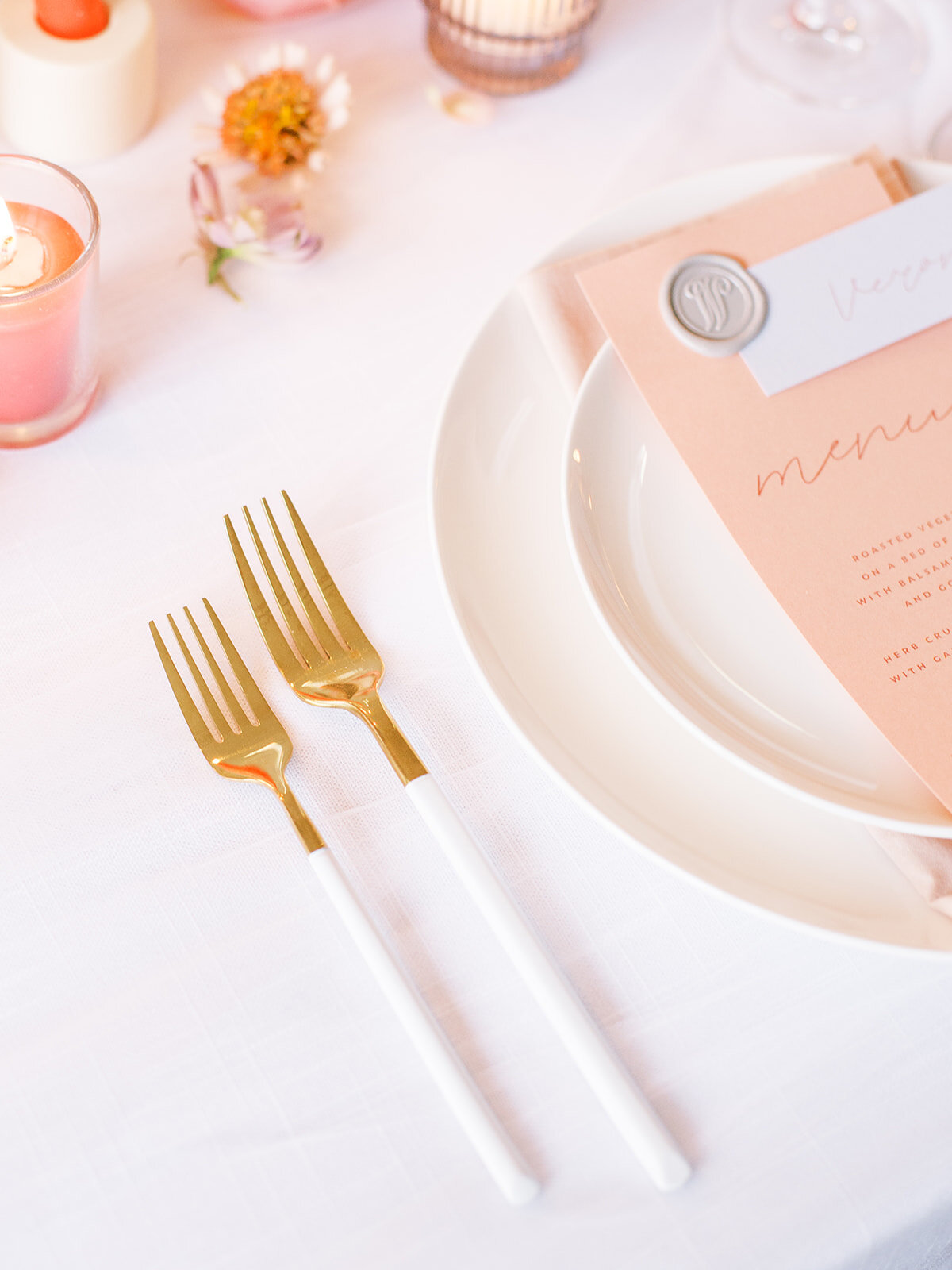
She suggested that we use a vellum outer envelope, to show off the flirty pieces inside, and also added a lot of visual interest through the use of different coloured stocks, the rounded edge, and a tall and narrow menu card and place setting on the table.
Florals
I planned two completely different sets of floral ingredients — a spring set (for my original shoot date), and a summer set. I lucked out with my August shoot date, because I was able to incorporate many of my favourite locally grown summer flowers!
Locally grown flowers have the BEST colour variations, with flecks and speckles that perfectly blend a palette and simply aren't possible with wholesale flowers.
The Tablescape
Full florals in the centre of the table, coloured taper and votive candles, gold-dipped flatware combined with clean, modern place settings…Designing a tablescape is all about layering together varied elements to create a unique, personalized look.
I wanted a clean, minimal base for all my colour, so the foundation of white linens with a white tulle topper was perfect.
The Cake
This cake!
I sent Jenna a really pathetic sketch, after having this idea of incorporating both hand-painted flowers and 3D sugar flowers that would move in from the outsides of the cake. I knew I wanted to create some sort of floral piece encircling the cake. I explained this haphazard idea to Jenna and she took it and made it 1 million percent better. This cake is so stunning! It felt fresh, unique, and playful.
The original plan for the cake was so different. This just goes to show you that sometimes, sitting on an idea and seeing where it goes can be a very good thing!
The same goes for your wedding planning: Don't feel like you need to make every decisions or have every answer at the same time.
Some ideas just need time to come together.
I’m so grateful to everyone who shared their talents to be a part of this editorial. I originally started brainstorming this before the first Covid shutdown, and at that point I was just going to focus on a tablescape. Esther suggested that I add a model, and I’m SO glad I followed her advice! One of my favourite details from this editorial was the ensembles created by Maison Corazon for the bride — they could not have been more perfect.
The way this entire project came together was so life-giving and exciting.
Esther Funk Photography ~ stone house creative ~ Planned Perfectly ~ C&T Rentals ~ Trend Rentals & Decor ~ Robin Egg blue design ~ Maison corazon ~ Jenna Rae Cakes ~ Jessica Kmiec Artistry ~ Beauty by B Fey ~ Prairie Clay ~ Mokada Custom Jewelry
LOOKING FOR A WEDDING FLORAL AND EVENT DESIGNER IN WINNIPEG?
Getting married in 2022? Appointments to plan your dream florals are now available. Click the button below to get started!
Flowers are the best way to make a statement at your wedding. Whether you already have a specific vision or want me to dream up something custom just for you, reach out to Stone House Creative for stunning bridal bouquets, truly unique ceremony backdrops, and beautiful floral centrepieces to create the perfect ambiance for your wedding!


