Wedding Inspiration Series: Colour Palette Ideas
Inspiration For yOur Wedding Colour Palette
We’re back with our latest blog mini-series, with the aim of giving you all the inspiration you need to get into wedding planning. I know that a lot of the different areas of wedding planning can be…let’s say, un-fun…but I hope that all of the pretty can feel like a breath of fresh air for you and reinvigorate your ideas with new inspo!
Today we’re highlighting colour palette inspiration trending for 2025. If you’ve been following me for any amount of time, you’ll know that I’m OBSESSED WITH COLOUR. And when I say that, don’t get nervous: when I say COLOUR, I don’t mean that it has to be neon. Or rainbow. Or Crayloa bright (unless that’s what you want).
There’s such a wide range of what we can do with colour. It really sets the stage for your overall ambiance and vibe, and that’s why colour palette is ALWAYS what I start with when I design a wedding. Layering in different shades and tones, adding depth in just the right places, or a pop of something really vibrant to bring that breath of life…nothing but colour can do that.
Photos by Brittany Mahood
Colour Palette Inspo 1: Pastels
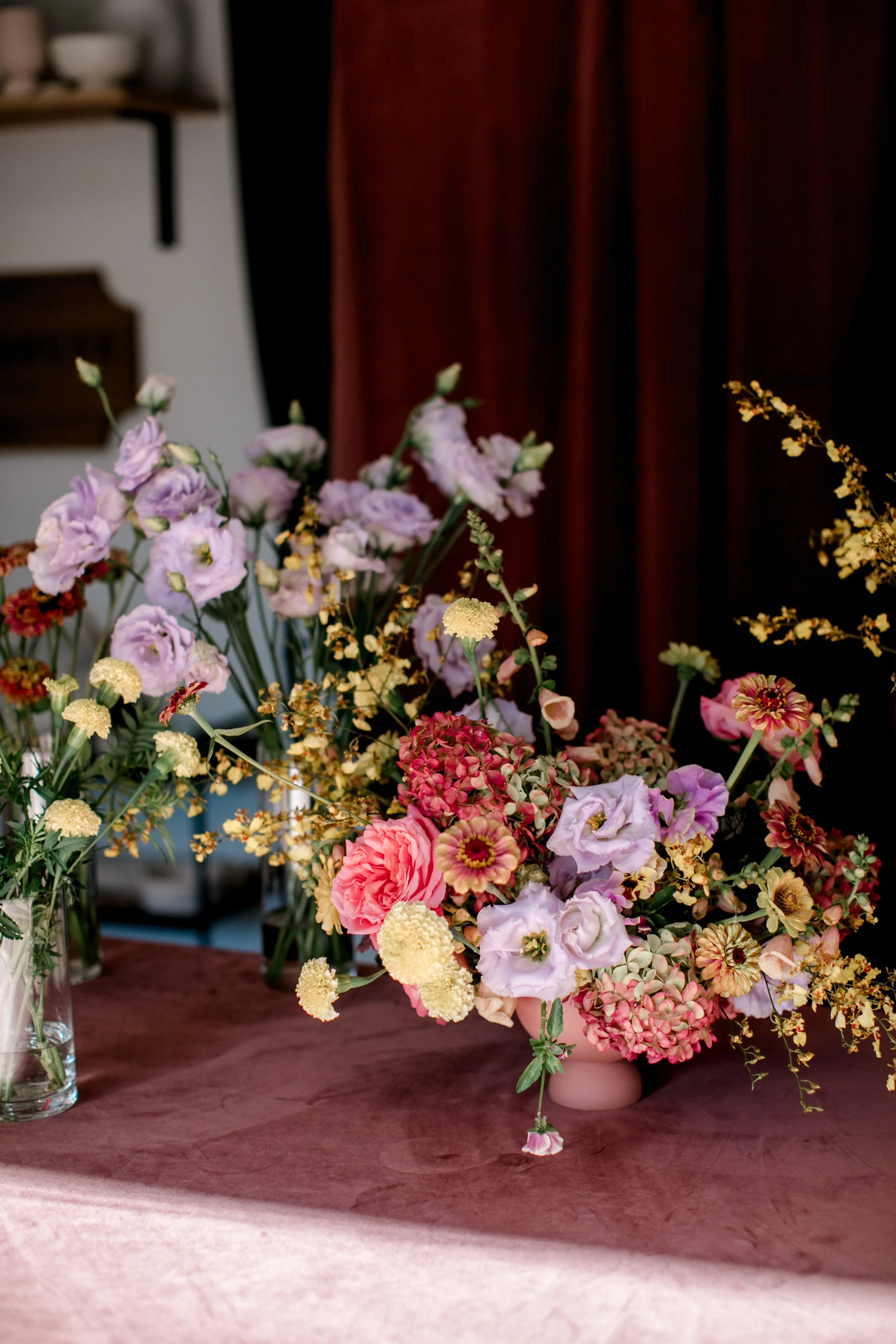
One of the main things I’m seeing for next year is pastels on pastels. 10 years ago we did a ton of romantic pastels, and it’s back in a big Taylor Swift-loving way. But, we’re not just going to go sugar sticky sweet with baby pinks and blues and lavenders. We’ll amp it up in a modern way, of course! That might be a hint of lime or a few pops of saturated pinks that blend with the softer tones, like in the image below.
One of the best ways to ensure that you’ll love your pastel palette is to use locally grown flowers. Locally grown flowers are the BEST for blending a delicious palette (but, of course, you’re limited on the season). We’ll often see multiple tones within a single local bloom, which is what gives us the ability to blend that palette and create something with depth for you.
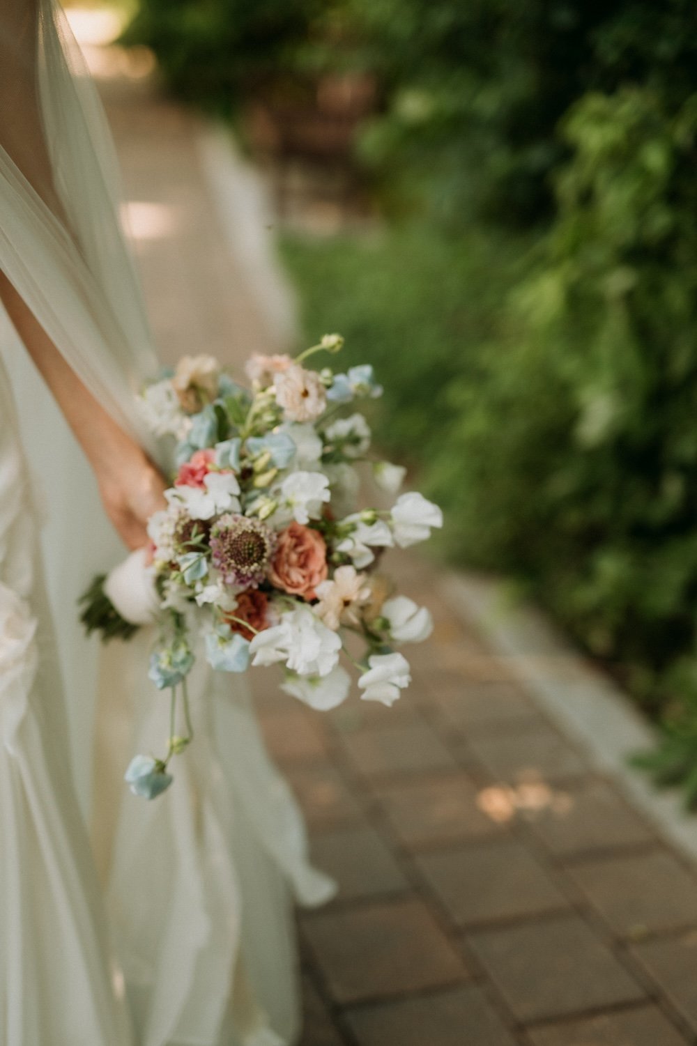
Below is one of my favourite bouquets I designed this year, in a lovely pastel fluttery combination that was meant to compliment her fluttery ethereal dress. We used more saturated peaches and lavenders throughout the decor flowers, but her bouquet was light and dreamy.
Colour Inspo 2: Reds
Just like in fashion, red has been all the rage in weddings and it’ll continue to move that way for another year or two. I know that a lot of you are afraid of red. You don’t have to be. Yes, it’s bold and it makes a statement BUT do you really want to spend a lot of money on a wedding that doesn’t make any statement at all?
A few ways to play with this:
-Go for a full monochromatic look. Shades of red together is really strong and delicious. I remember a former boss of mine softly suggesting to a bride that she not choose red and white, because it would look like the target symbol…amen to that! If you’re going to go for a bold tone like red, then fully commit to get the most impact.
-Red can read very classic. It can also read very modern, or very bold, etc etc. Choose what direction you want to go and make sure to communicate that to your floral designer, because different shades or varieties of flowers will make or break your look.
-Don’t be afraid to darken your palette for a moody fall/winter wedding, or play it up with some chartreuse or caramel tones for something more summery and fun.
Above are two images from a recent fall wedding we designed at the WAG with Soiree Event Planning. The creative brief called for deep, moody tones of burgundies, dark reds, and plums with architecturally-inspired designs. Obviously we LOVED IT. Much more to come!
Colour Inspo 3: Soft Yellows
This is obviously an extension of the pastel palettes, but one shade I expect we’ll be seeing a lot of (and that I would LOVE to design for you!!) is soft yellow. This hue has a naturally wildflower look to it, and pairs beautifully with soft greens and whites for a really fresh feel. I think soft yellow is best when left on its own or in a simple pairing like these images below, but you could also tuck in a bit of pale pink for some more femininity.
Now, one thing to know is that there aren’t a ton of readily available soft yellow flowers. It’s strange — some of our local growers specifically save seed from their blooms that have been paler than others, so that they can try to encourage the lighter tones more. So, the key is just to avoid using anything that’s too bright, and then working with your fashion and stationery choices to bring in more of that soft yellow. And don’t be put off if your florist suggests something that’s “cream” because that can be the perfect way to pull it together!
LOOKING FOR A WEDDING FLORAL AND EVENT DESIGNER IN WINNIPEG?
I hope you get the idea now, that we’re unapologetic lovers of colour. We would love to make some magic happen for your wedding.
Call me biased, but flowers are the best way to make a statement at your wedding. Whether you already have a specific vision or want me to dream up something custom just for you, reach out to Stone House Creative for stunning bridal bouquets, truly unique ceremony backdrops, and beautiful floral centrepieces to create the perfect ambiance for your wedding!


